(See part one here.)
I left off at "stylistic consistency" and the Principles of Design. Then I turned off my computer and realized that this is turning into a freaking "Intro to Art" lecture. So we'll just skip over the part where I go on and on and on about how artistic design works, and get right down to the meat and potatoes: how all this applies to the set design for The Felties. (If you are interested in the art lecture, I recommend you read this article by John Lovett. The terminology is different from what I use here, but it'll give you the right idea. Googling "Principles of Design" will unearth a plethora of other articles on the subject.)
As I learned them, the Principles of Design are:
- Balance
- Contrast
- Focus
- Rhythm
- Unity

So I'm going to do a real brief evaluation of The Felties, using the Principles of Design as my guide:
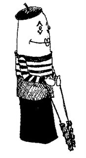
- Balance: The Felties are very symmetrical, with occasional touches of asymmetry (Such as Mimey's beret.)
- Contrast: Very basic. Mimey has a very vertical shape, yet wears horizontal stripes. Contrasting colors are sometimes used (Pupsumoto's skin tone is pink and his armor is green). Very simple contrast, when employed.
- Focus: Their faces/heads. Mimey's head is almost as big as the rest of his body! This is the most expressive part of these puppets.
- Rhythm: (also "repetition" or "pattern") Patterns have been kept to a minimum on these puppets. Mimey wears stripes because he is a mime. Clownie wears a very simple star pattern. Pupsumoto's kimono has a very simple floral motif.
- Unity: Skin tones are all basic felt colors - pink, yellow, white, blue, grey, etc. The shape of the puppets is basically the same, with minor variations (the "upside-down 'U'"). Facial features are very simple; suggested rather than realistic.
Okay, so there is the evaluation. Now I'm going to take what I wrote above and design a set that is stylistically consistent with the design of the puppets (thus extending the "unity of design" to the environment The Felties inhabit!) Stay tuned, true-believers, for part three of this series!
1 comment:
I'm pleased that you've extended the theme of the puppet design to the set design. It really helps create a unique universe when all of the design elements are consistent. I think it helps when the set and the puppets and/or costumes aren't in competition with one another. It makes it easier to enjoy the completed product.
Post a Comment