Well, I wish the transformation was more spectacular. I guess this is more of a lesson in the subtleties of scenic design.
I vaguely remember a conversation I had with my set design professor in college. I was preparing a model of a set I designed for the American College Theatre Festival (ACTF) regional design competition. This set was a monolithic puke-pile of raised platforms and ramps that really "owned" the black-box theatre it was designed for. There was not much room for the actors backstage, and the audience was mere inches from the edge of the acting space.
redeeming an otherwise mediocre design were the stained-glass windows I designed and built (with help from Garrick and moral support from Pamela.) They hovered around the set, each one signifying a different locale. The icing on the cake was a very elegant lighting design by Rodney Fadely (where the hell are you, Rodney?) that added mystery and intrigue to an otherwise clumsy design.
Anyway, I tell the Prof. "You know, I think I may win this competition. My model looks great, with all these miniature stained-glass windows and working lights." The Prof. kind of shrugged and said "It's almost better not to win." His point was that a truly well executed design is never noticed. The audience accepts it so completely that they never have any attention on it. No attention = no awards.
This brief moment of college history is my way of saying the set design for The Felties is still pretty bland (or "subtle") at this point, but I consider the evaluation I did last time a success.
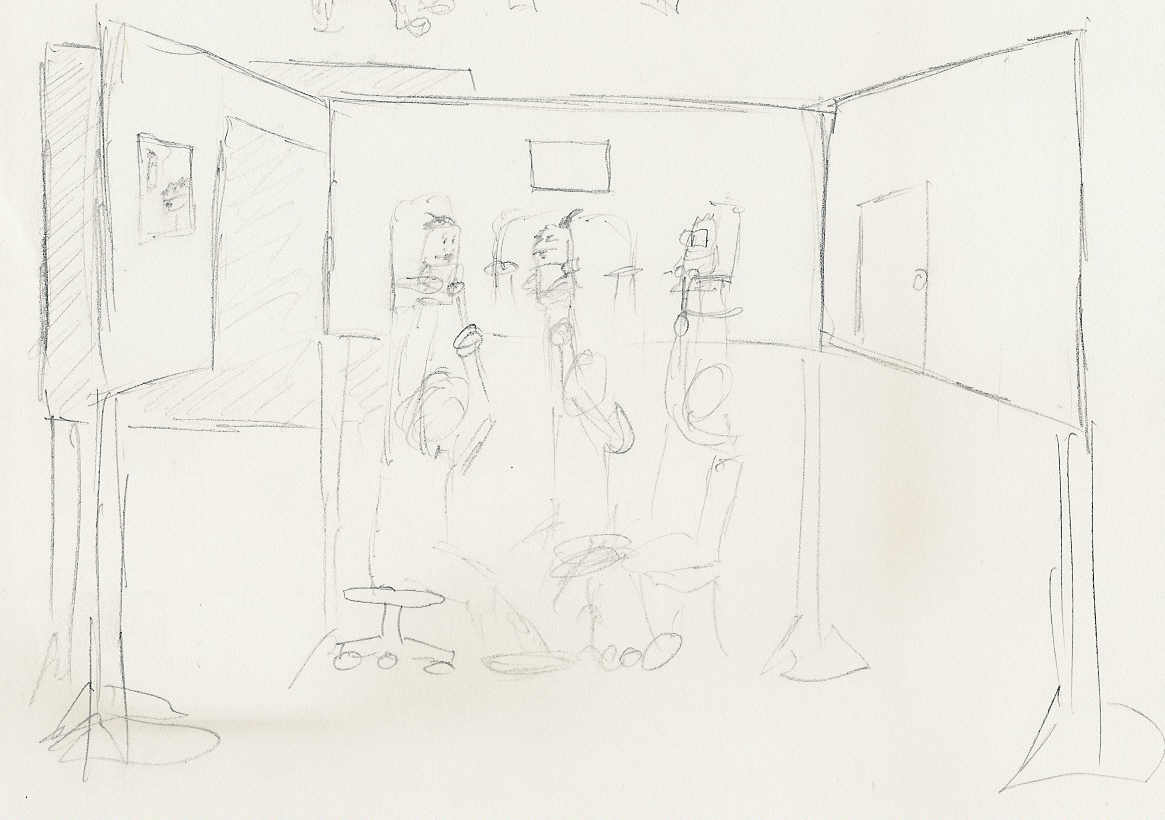 Here is the earliest sketch I can find for The Felties set (a.k.a. the "Svelte Felt Bachelor Pad.") Booooring.
So I did my Principles of Design evaluation long hand, in one of my composition notebooks. As I was writing, I had a mild epiphany: One of the consistent things about the Felties, puppet to puppet, is the basic silhouette. The upside-down "U".
So I did a little thumbnail sketch:

Like I said, not a very spectacular breakthrough.
Spanish arches! Of course! It unifies the design of the apartment with the design of the puppets!!! EUREKA!
I shared this breakthrough with Pamela, who promptly reminded me that I did name the apartment building "Casa de Manos", so Spanish-styling would only make sense. I kind of chuckled: I named it "Casa de Manos" because The Felties universe is very Southern California inspired (lots of Spanish names around here -- Los Angeles, San Diego, La Cienega, etc.) and "Casa de Manos" means "House of Hands" (The Felties are hand puppets.)
So next time, to wrap up this little mini-series, the finished design for The Svelte Felt Bachelor Pad. Will I just rip off the Three's Company set and be done with it? Perhaps ...

No comments:
Post a Comment